ConstraintLayout
ConstraintLayout allows you to create large, complex, dynamic and responsive views in a flat hierarchy. This is the default layout in Android Studio.
dependencies {
    implementation "androidx.constraintlayout:constraintlayout:2.1.2"
    // To use constraintlayout in compose
    implementation "androidx.constraintlayout:constraintlayout-compose:1.0.0-rc02"
}
relative positioning
Following constraints allow to position a given widget relative to another one:
- layout_constraintLeft_toLeftOf
- layout_constraintLeft_toRightOf
- layout_constraintRight_toLeftOf
- layout_constraintRight_toRightOf
- layout_constraintTop_toTopOf
- layout_constraintTop_toBottomOf
- layout_constraintBottom_toTopOf
- layout_constraintBottom_toBottomOf
- layout_constraintBaseline_toBaselineOf
- layout_constraintStart_toEndOf
- layout_constraintStart_toStartOf
- layout_constraintEnd_toStartOf
- layout_constraintEnd_toEndOf
Horizontal axis: left, right, start and end sides.
Vertical Axis: top, bottom sides and text baseline.
Possible values are a reference id to another widget, or the parent.
<!-- align left side of button
to the left side of parent container -->
<Button android:id="@+id/button" ...
                 app:layout_constraintLeft_toLeftOf="parent" />

<!-- Align left side of buttonB to the right side of buttonA, i.e.
buttonB follows after buttonA. -->
<Button android:id="@+id/buttonA" ... />
<Button android:id="@+id/buttonB" ...
                 app:layout_constraintLeft_toRightOf="@+id/buttonA" />
margins
You can use the usual margin layout options. You can also specify an alternate value when the related view has a visible state of GONE.
- android:layout_marginStart
- android:layout_marginEnd
- android:layout_marginLeft
- android:layout_marginTop
- android:layout_marginRight
- android:layout_marginBottom
- layout_marginBaseline
- layout_goneMarginStart
- layout_goneMarginEnd
- layout_goneMarginLeft
- layout_goneMarginTop
- layout_goneMarginRight
- layout_goneMarginBottom
- layout_goneMarginBaseline
centering and bias
When you assign the opposite constraints of relative positioning, widget will be centered horizontally or vertically.
<!-- The button will be centered horizontally if width of button not auto sized.  -->
<androidx.constraintlayout.widget.ConstraintLayout ...>
    <Button android:id="@+id/button" ...
                 app:layout_constraintLeft_toLeftOf="parent"
                 app:layout_constraintRight_toRightOf="parent"/>
Additionally you can tweak the positioning to favor one side over another using the bias attributes:
- layout_constraintHorizontal_bias
- layout_constraintVertical_bias
<!-- Default bias is 0.5, i.e. 50%.
     And in this example bias 0.3, i.e. 30%. -->
<androidx.constraintlayout.widget.ConstraintLayout ...>
    <Button android:id="@+id/button" ...
        app:layout_constraintHorizontal_bias="0.3"
        app:layout_constraintLeft_toLeftOf="parent"
        app:layout_constraintRight_toRightOf="parent"/>
circular positioning
You can layout widgets around other widget using the following attributes:
- layout_constraintCircle - the id reference of the widget in center
- layout_constraintCircleRadius - the distance to the other widget center
- layout_constraintCircleAngle - which angle the widget should be at in degrees
<Button android:id="@+id/buttonA" ... />
  <Button android:id="@+id/buttonB" ...
      app:layout_constraintCircle="@+id/buttonA"
      app:layout_constraintCircleRadius="100dp"
      app:layout_constraintCircleAngle="45" />
layout dimensions
You can define minimum and maximum sizes for the ConstraintLayout itself:
- android:minWidth - the minimum width for the layout
- android:minHeight - the minimum height for the layout
- android:maxWidth - the maximum width for the layout
- android:maxHeight - the maximum height for the layout
Those minimum and maximum dimensions will be used by ConstraintLayout when its dimensions are set to WRAP_CONTENT.
child dimensions
MATCH_PARENT is not recommended for widgets contained in a ConstraintLayout. Similar behavior can be defined by using MATCH_CONSTRAINT with the corresponding left/right or top/bottom constraints being set to "parent".
By default WRAP_CONTENT means that constraints will not limit the resulting dimension. In general this is enough and faster. To keep enforcing constraints to limit the resulting dimension use following attributes:
- layout_constrainedWidth - boolean value
- layout_constrainedHeight - boolean value
MATCH_CONSTRAINT or 0dp allows to have the resulting size take all the available space. You can modify result using following attributes:
- layout_constraintWidth_min - can be either a dimension in Dp, or "wrap", which will use the same value as what WRAP_CONTENT would do
- layout_constraintHeight_min -//-
- layout_constraintWidth_max -//-
- layout_constraintHeight_max -//-
- layout_constraintWidth_percent - set the size of this dimension as a percentage of the parent
- layout_constraintHeight_percent -//-
To use percent, you need to set the following:
- the dimension should be set to MATCH_CONSTRAINT (0dp)
- the default should be set to percent
- layout_constraintWidth_default="percent" or
- layout_constraintHeight_default="percent"
- then set the layout_constraintWidth_percent or layout_constraintHeight_percent attributes to a value between 0 and 1
layout_constraintDimensionRatio attribute defines a ratio between width and height or vice versa. To constrain one specific side based on the dimensions of another, you can pre append W, or H, to constrain the width or height respectively.
<!-- width must be equal to height -->
<Button android:layout_width="wrap_content"
    android:layout_height="0dp"
    app:layout_constraintDimensionRatio="1:1" />

<!--  set the width of the button following a 16:9 ratio,
    while the height of the button will match the constraints
    to its parent -->
<Button android:layout_width="0dp"
    android:layout_height="0dp"
    app:layout_constraintDimensionRatio="H,16:9"
    app:layout_constraintBottom_toBottomOf="parent"
    app:layout_constraintTop_toTopOf="parent"/>
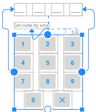
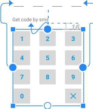
chains
Chains provide group-like behavior in a single axis like LinearLayout.
A set of widgets are considered a chain if they are linked together via a bi-directional connection. For example, below chain of two TextView,
Chains are controlled by attributes set on the first element of the chain (the "head" of the chain).
Use the following attributes to define how the elements should be laid out in the chain:
- layout_constraintHorizontal_chainStyle
- layout_constraintVertical_chainStyle

- spread - default value, the elements spread out over the available space
- spread_inside - the endpoints of the chain will not be spread out
- packed - the elements display packed together, can be combined with bias constraint
The default behavior of a chain is to spread the elements equally in the available space. If one or more elements are using MATCH_CONSTRAINT, they will use the available empty space (equally divided among themselves).
Use the following attributes to define how the space will be distributed among the elements using MATCH_CONSTRAINT (0dp):
- layout_constraintHorizontal_weight
- layout_constraintVertical_weight
This behaviour is similar to the weights in LinearLayout.
<!-- chain of two TextView,
connections are underlined -->
<TextView
    android:id="@+id/txtView1"
    ...
    app:layout_constraintLeft_toLeftOf="parent"
    app:layout_constraintRight_toLeftOf="@+id/txtView2"
    app:layout_constraintHorizontal_chainStyle="spread"
    app:layout_constraintTop_toTopOf="parent" />

<TextView
    android:id="@+id/txtView2"
    ...
    app:layout_constraintLeft_toRightOf="@+id/txtView1"
    app:layout_constraintRight_toRightOf="parent"
    app:layout_constraintTop_toTopOf="parent" />
flow
Flow is a helper virtual layout added in ConstraintLayout 2.0. It allows positioning of referenced widgets horizontally or vertically. It also allows placement across multiple rows or columns.
For example, it is a good alternative to the GridLayout and RecyclerView with GridLayoutManager to create grid.
Unlike chain you don't need to create bi-directional connections between elements in a flow group. Flow is similar to the CSS flex model.
flow_wrapMode property defines a placement mode. Possible values are:
- none - simply create a chain out of the referenced elements. In this mode following properties are allowed:
- flow_horizontalStyle = "spread|spread_inside|packed"
- flow_verticalStyle = "spread|spread_inside|packed"
- flow_horizontalBias = "float"
- flow_verticalBias = "float"
- flow_horizontalGap = "dimension", spacings between views or wrapped lines
- flow_verticalGap = "dimension"
- flow_horizontalAlign = "start|end"
- flow_verticalAlign = "top|bottom|center|baseline
- chain - similar to wrap none in terms of creating chains, but if the referenced widgets do not fit the horizontal or vertical dimension, they will wrap around to the next line / column. You can use additional properties:
- flow_firstHorizontalStyle = "spread|spread_inside|packed"
- flow_firstVerticalStyle = "spread|spread_inside|packed"
- flow_lastHorizontalStyle = "spread|spread_inside|packed"
- flow_lastVerticalStyle = "spread|spread_inside|packed"
- flow_firstHorizontalBias = "float"
- flow_firstVerticalBias = "float"
- flow_lastHorizontalBias = "float"
- flow_lastVerticalBias = "float"
- flow_maxElementsWrap = the number of elements before wrapping, regardless if they fit or not in the available space
- aligned like chain, but views from different lines will be aligned
<!-- view1, view2, view 3 will be on first row
      view4, view5 on second row  -->

<androidx.constraintlayout.helper.widget.Flow
    android:id="@+id/flow"
    android:layout_width="match_parent"
    android:layout_height="wrap_content"
    app:constraint_referenced_ids="idView1,idView2,idView3,idView4,idView5"
    app:flow_horizontalAlign="start"
    app:flow_horizontalBias="0"
    app:flow_maxElementsWrap="3"
    app:flow_verticalBias="0"
    app:flow_verticalGap="8dp"
    app:flow_wrapMode="aligned"
    app:layout_constraintEnd_toEndOf="parent"
    app:layout_constraintStart_toStartOf="parent"
    app:layout_constraintTop_toTopOf="parent" />
In chain mode, you can assign a separate style to the first and last lines. It is useful when the first line or last line have less elements then other lines. Description of style values:
- spread - adds space before the first element, between elements and after the last element to evenly fill the line
- spread_inside - adds space between elements to evenly fill the line
- spread_inside - doesn't add space automatically, you can still assign the space manually with the gap property
app:flow_horizontalStyle="spread_inside"
app:flow_lastHorizontalStyle="spread"
app:flow_horizontalStyle="spread_inside"
barrier
Barrier is a helper virtual layout that can be used as divider. Barrier adjusts its position relative to the most extreme widget on the specified side.
End direction example
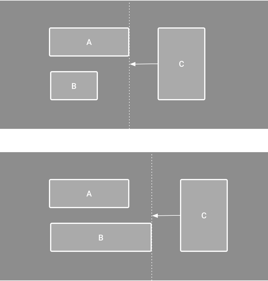
The barrierDirection property defines side of widgets, possible values are:
- top
- bottom
- start
- end
- left
- right
keyframe animations
A ConstraintSet is a lightweight object that represents the constraints, margins, and padding of all child elements within a ConstraintLayout. When you apply a ConstraintSet to a displayed ConstraintLayout, the layout updates the constraints of all of its children.
You can build animation with ConstraintSet to animate the size and position of child elements. You can not animate other attributes such as color.
// MainActivity.kt

fun onCreate(savedInstanceState: Bundle?) {
    super.onCreate(savedInstanceState)
    setContentView(R.layout.keyframe_one)
    constraintLayout = findViewById(R.id.constraint_layout) // member variable
}

fun animateToKeyframeTwo() {
    val constraintSet = ConstraintSet()
    constraintSet.load(this, R.layout.keyframe_two)
    TransitionManager.beginDelayedTransition()
    constraintSet.applyTo(constraintLayout)
}
group
Group is a helper virtual view that allows to control a visibility of the referenced views.
<androidx.constraintlayout.widget.Group
    android:id="@+id/group"
    android:layout_width="wrap_content"
    android:layout_height="wrap_content"
    android:visibility="visible"
    app:constraint_referenced_ids="button4,button9" />
layer
Layer is a helper virtual view that allows to control the visibility and elevation of the referenced views. Added in 2.0.
It is used to animate group of elements.
<androidx.constraintlayout.helper.widget.Layer
   android:id="@+id/layer123"
   android:layout_width="wrap_content"
   android:layout_height="wrap_content"
   app:constraint_referenced_ids="view1,view2,view3"
   tools:ignore="MissingConstraints" />
// Layer object will evaluate pivot point itself
rotate123.setOnClickListener {
ValueAnimator.ofFloat(0F, 360F)
.apply {
addUpdateListener { animator ->
layer123.rotation = animator.animatedValue as Float
// we don't need calculate rotaion for view1, view2, view3
// layer object will calculate a pivot point by itself
// and rotations for view1, view2, view3
}
duration = 2000 // in ms = 2 sec
start()
}
}